1. Thoughtfully Designed Home Page


2. Simple Navigation Menu
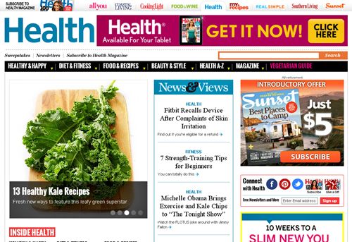
One of the key features of any good home page is the designing and working of navigation menu. Make sure it is simple, clutter free, self explanatory and works like a charm. Typical example is “Health.com”. Observe how the navigation functions. The list of pages is built below the main sections which by default are hidden. Simply roll over your mouse and the pages slide out.Health.com
Ocoee River Rafting

2. Sub-menus should generally be hidden under the main menu to make the design clutter free.
3. Less clutter means faster loading site which is a crucial SEO metric.
4. Make sure your navigation menu is just an invitation to exploit a particular section further. Avoid decorations or unwanted enhancements as it will distract your visitor.
3. Search Box
A search box feature is typically available in ecommerce websites or those which sport hundreds of pages. Search box position is essential in such a scenario. Set it up at the very top of the page, preferably on the right. It is a proven fact that this position attracts human attention instantly. It also means your visitor has a handy tool to exploit your website further, thereby offering a satisfying experience.Search box is an effective website element which behaves like a self help mechanism and reduces search time considerably. Look at this “WomensHealthMag” where the search box is just a standalone element. There are no distractions around it. Predictive text helps reduce the search time further by offering relevant links as soon the visitor starts feeding his/her search query.
WomensHealthMag

Trailers

1. Position the search box in a clutter free space, away from other page elements.
2. Label the text box correctly and make sure the default text wipes off automatically when the user clicks on it.
3. While adding an advanced search option, make sure you don't confuse the visitor.
4. Social Media Links
“Alive.com” and “Havahart Traps” are two perfect examples of how social media links needs to be placed. While the former has the icons placed along the right side panel, the latter has them positioned along with newsletter subscription text box. Social media links tell your visitors that you are moving with the times and would like to interact with them. It is a heart warming experience for visitors who can now voice their appreciation or criticism through your social pages such as Facebook, Twitter or LinkedIn.Alive.com


5. Mobile Website
Offering an alternate company site, typically for mobile devices such as phones and tablets is essential from SEO and sales point of view. One of the built-in features of any smart phone is GPS which is exploited to locate services, directions and also behaves as a store locator.It simply means increase in visitor numbers, sales and revenues. However, your site needs to be compatible with mobile devices. A normal desktop based online presence will not work on smaller displays. You need to create a dedicated one for such displays and resolutions for an enjoyable browsing experience. ”TheAppBusiness” and ”eCigs” are two such instances. Both these companies have done a great job by offering intuitive mobile experience. It is responsive, well designed and mobile friendly.
TheAppBusiness


6. Contact Information
Building trust is one of the core objectives of any online presence, particularly your website. By providing a contact us page which incidentally is the second most important page after the home page you tell your visitors; "People, do contact us at this ‘Real’ ‘Physical’ address in case of difficulty". Real world addresses build confidence unlike URL's which are nothing but virtual addresses.Your contact us page should contain the following information along with lead generation form also called feedback or response form.
1. Provide an easy to locate button for this section. Here is an example - “Sand Sports” which gives you an insight into positioning this element. It consists of JavaScript validation, an essential feature of lead generating form.
Sand Sports

3. Make sure your form (Feedback) has a captcha feature to prevent spam. “Results you Deserve” uses an effective anti spam feature. It is simple, effective and looks classy. Observe how it blends with the website seamlessly.
Results you Deserve

7. Clear Heading
Headers have evolved over the years. It started with extremely thin bars. Later, they broadened to accommodate more information, and still later they really stood out tall and wide. Today, the concept of headers has changed completely. Check out the “eBinjury” website. Observe how this website has incorporated a beautiful large header with a slider embedded inside. Each image in the slider offers vital answers. A visitor is forced to read the content within the image because of its exquisite design.eBinjury

Hydroworx

8. Site Description
Meta description is essential from several aspects, prominent among them are as follows:1. Search Engine - Whether your targeted search engine awards you or not for using Meta tag description it is essential to exploit this tag/element. It basically informs search engines about the content of your website in a nutshell, typically in just 160 characters, which in turn is reflected in their SERP.
2. Click through Rate - The display of synopsis in SERP means increase in click through rate. The reason is because of the content relevancy, which will force the user the click on the link irrespective of the source; whether the link was found through organic search or paid display ad.
Check out the meta descriptions of these two websites, “Pulsion” and ”OilScams”, and observe how effectively they have exploited the 160 character description limit.
9. Lots of Good Content
It is no longer a secret that freshness, length and the quality of content plays an important role in fetching a higher search engine ranking. Good content can be found on these pages, that typically inform the readers about West Nile Virus and Mosquito Allergies. Remember, longer the content, better the award in terms of rank.West Nile Virus

Mosquito Allergies

SkinCareaTmeta

10. Images and Videos
Some astonishing facts about Images and videos which are self hosted or shared on social networking sites include enhanced viewer ship and engagement; a jump of 40% to 90%. A typical example is content or link posted on Facebook which generates 37% increased interest if it carries an image. Yet another amazing fact is the spike in number of people who click the buy button after looking at an image.Examples:
Organic Gardening

TarasovnyLaw

Example:
Backhoe

11. Call to Action
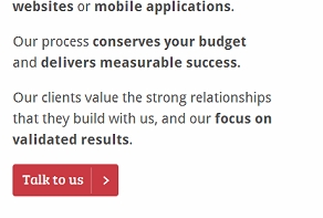
Check out “whiteoctober.co.uk” site. Feel the excitement as soon you hit the home page. A huge header welcomes you. The menu at the top cajoles and coerces you to go one step further and check out the link which says "What we do?" Yes! This is the power of call to action. This link takes you to yet another option called "Talk to us"; a perfect way to interact with clients and visitors.whiteoctober.co.uk
“Toniguy” is yet another example which offers a big bright button called "Shop Online" above the massive slider. Simple, neat and hassle free way of asking your visitors to go ahead and indulge in shopping.
Toniguy

Remember, call of action page should always make a visitor feel at home, and coerce him/her gently, turning that web entity from a visitor to customer.
Other Example;
Disability Lawyer

12. An “About Us” page -
About us is the third most important page after home and contact us. It should quickly and effectively provide the following information.1. Who you are? This reflection could be in the form of a brand, face or a logo along with a punch line.
2. What you do? Talk about your products/services in few words.
3. People associated with you. Tell your visitors about the people who run the company, and also mention their qualifications and education.
4. Location - The place where your company is located.
About us is like your website face. Let your visitors see the man behind the company. Add a large image or even a video, typically the CEO, director, principle etc. Check out this site, “Jay Group” an integrated marketing solutions company that covers the above requirements perfectly.
JayGroup

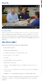
“Haller” is another site which has all the elements in its about us page. This renovation company uses a video to talk about its people, achievements and services. “The American school in England” is yet another example.
Haller

13. Testimonials
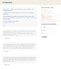
Testimonials build trust. They also fetch new clients and generate leads. Testimonials are typically requested after you finish a project or a service successfully. Many times even happy and satisfied clients are not too eager to provide testimonials, as it means endorsement which is a serious affair.However, you can make it easy for your satisfied clients. Just ask them for a brief note; saying that they are happy with your services and would highly recommend your name to others. If possible attach an image to such a testimonial, to make it look authentic. Add a video, email address or even a digital signature. “LaserSkinCare” offers testimonials in a nice comment box style.
LaserSkinCare
14. Locations That You Serve
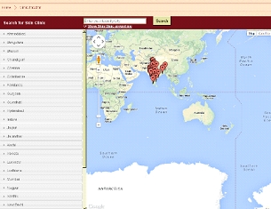
While some transactions do not require a web customer to actually know or use real address, there are instances where the client would want to visit you to exploit your services. Beauty treatment website is one such example where a person actually needs to go to a brick and mortar location for beauty treatment.For Example
Kaya Clinic
Saffire Ecigs

15. List the Services that You Provide
As mentioned above, it is crucial that you provide the list of services on the very first page, typically your home page. “Clarity Way” a premier luxury drug and alcohol rehabilitation centre is a perfect example. Yet another paradigm is “Intellectsoft” which uses a large hero area and bold fonts to inform visitors about their services which incidentally is “Mobile Strategy & Consultancy”.Clarity Way


Gagan, mobile design is a biggie. I made sure my blog looked good on mobile devices a while back and traffic has since improved quickly. Thanks dude!
ReplyDeleteI agree the Mobile development aspect is extremely important. Blog Engage is full responsive and our traffic on mobile devices had increased 100% I paid a lot of money for our chat to be mobile as well but I've not been very satisfied with that so far, poor development.
ReplyDeleteYou should go with a expert developers. I love Blog Engage community. Thanks for comment Brian :)
Deleteinformation was helpful to me to improve and grew up..... Make Money , Blogging Tips
ReplyDelete